The Short Answer: There Is No Official Good Number
If you searched for how many GitHub contributions per year is good, the most honest answer is that GitHub does not publish a universal pass mark. One hundred contributions may be a strong year for someone learning after work, while a maintainer with several active projects may reasonably produce many more. The number needs a story behind it.
A contribution graph is useful because it makes activity visible over time, but it is not a complete measure of engineering ability. The squares can represent different kinds of work, and the graph does not show the difficulty, review quality, ownership, or outcome of every contribution. If you are troubleshooting missing activity, start with the GitHub Contribution Graph Guide before interpreting the count.
For a portfolio, treat the yearly count as a conversation opener. A reviewer is more likely to trust a profile when the graph connects to readable repositories, clear README files, useful pull requests, issue discussions, releases, or demonstrations. A smaller but understandable record can be more persuasive than a full green wall with no project context.
The best benchmark is therefore personal and visible: did you work consistently, did the work become more useful, and can another person understand what you changed? Compare your recent months with your own available time and goals before comparing yourself with a stranger's total.
Judge GitHub Contributions by Context, Not a Leaderboard
The same number can mean very different things. A student may be learning a new language, a full-time developer may spend most of the week in private repositories, and an open-source maintainer may make fewer but higher-impact changes. Treat the table below as a set of questions, not as official ranges or a scoring system.
If you want to set a goal, choose a behavior you can control: one meaningful project session each week, a monthly release note, a reviewed pull request, or a documented issue. Those behaviors create evidence without forcing you to make low-value commits just to keep the graph green.
| Context | Useful signal | Better question |
|---|---|---|
| Learner | Regular practice across several months | Can you explain what you learned and show the code? |
| Side-project developer | A repeatable rhythm around one or two projects | Did the project gain features, tests, documentation, or users? |
| Open-source contributor | Reviewed changes, issues, discussions, and follow-through | Did your work help a project or its maintainers? |
| Maintainer | Releases, triage, reviews, and sustainable project care | Can visitors see the outcomes and decisions behind the activity? |
| Job seeker | Public proof connected to a clear professional direction | Could a reviewer understand your strongest work in five minutes? |
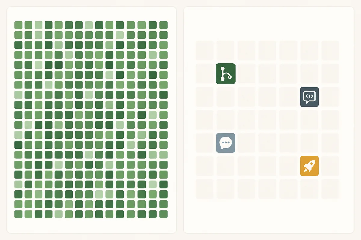
Why Contribution Quality Matters More Than the Raw Count
The graph is deliberately compact. It helps a visitor see whether activity happened, but it hides most of the details that determine whether the activity mattered. That is why a simple count should never be the only headline in a portfolio or job application.
Look for work that has a destination. A change merged into a shared project, a bug explained in an issue, a review that unblocked another contributor, a release that users can install, or a README that teaches a concept all give the graph context. These signals are not automatically better, but they are easier for another person to inspect.
Also account for what the graph cannot show. Private work may be anonymized, some activity may take place outside GitHub, and a repository can contain many generated or administrative commits. A quiet graph is not proof of inactivity, and a busy graph is not proof of skill.
Active weeks
Count how many weeks had purposeful work, not only the total number of squares. A steady pattern is easier to sustain than a last-minute spike.
Contribution type
Separate commits from pull requests, issues, reviews, discussions, and releases. Different roles produce different healthy mixes.
Project proof
Connect activity to repositories with a clear README, tests, examples, changelog, or demo so a visitor can verify the outcome.
Personal constraints
Compare the count with your available time, study schedule, employment, health, and private work. A fair benchmark includes the conditions behind the number.
A Practical GitHub Contribution Self-Scorecard
Instead of asking whether your number beats somebody else's, review the last three to twelve months with the same questions every time. This produces a more useful baseline for the next quarter and keeps the article's answer connected to actions you can actually control.
You do not need to publish private details to use this scorecard. Mark each row as clear, mixed, or missing, then choose one improvement. The goal is not to maximize green squares; it is to make the relationship between activity and useful work easier to see.
If your profile is part of a portfolio, put the strongest project explanation above decorative widgets. You can export a fixed visual later with the GitHub Contribution PNG guide, or use GitHub City when an interactive 3D presentation helps visitors explore the pattern.
| Check | Why it helps | Next action |
|---|---|---|
| Active weeks | Shows whether the practice is sustainable | Review gaps and choose a realistic weekly rhythm |
| Meaningful changes | Connects count to code or documentation outcomes | Pin two or three changes you can explain |
| Collaboration | Shows how you work with other people | Highlight a review, issue, discussion, or merged PR |
| Project clarity | Lets a visitor verify what the work does | Improve the README, demo, tests, or changelog |
| Recent trend | Prevents an old peak from hiding current direction | Compare the last quarter with the previous one |
| Honest context | Avoids misleading comparisons with private or different roles | Explain the type of work when the number needs context |
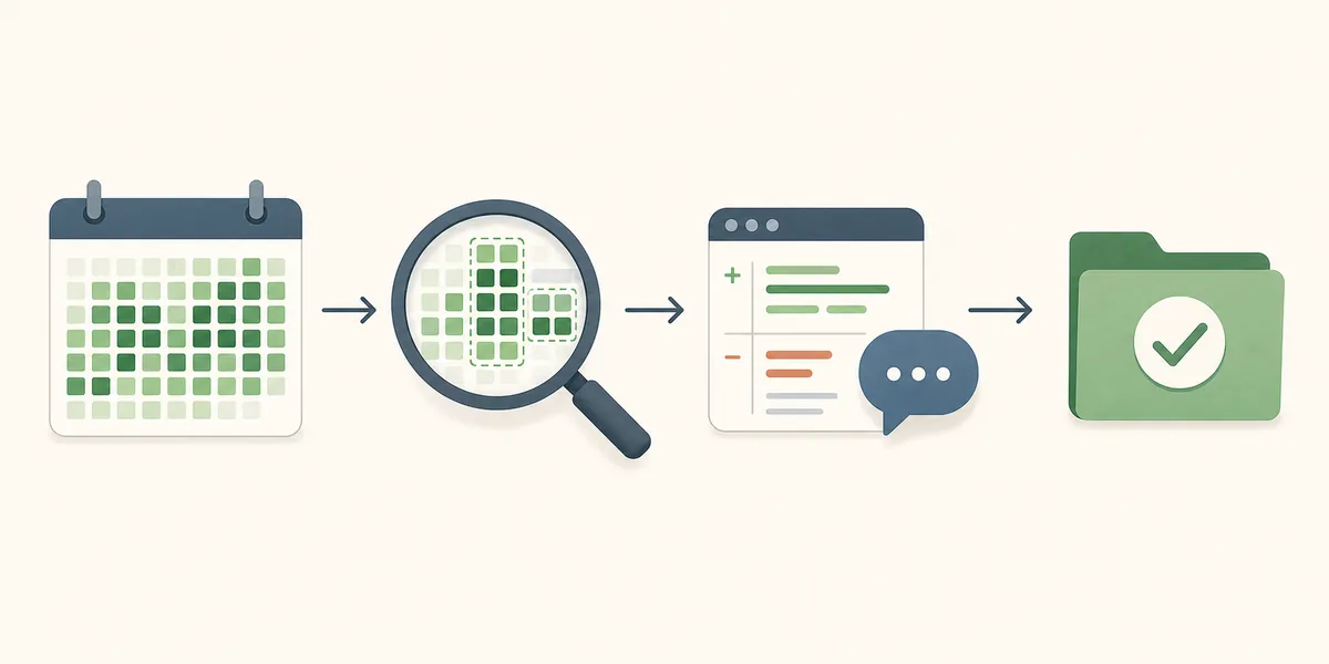
What to Do After You Check the Number
If you are worried because the graph looks empty, verify the source data before changing your routine. Check commit email, branches, repository visibility, private contribution settings, and update timing in the existing contribution guide. A visualizer cannot repair activity that GitHub did not count.
If the graph looks healthy, improve the surrounding portfolio. Choose one project to explain well, keep your profile README focused, and use visual tools only when they help a visitor understand the work. The count should support the story, not become the story.
Check contribution rules
Review counting, missing commits, privacy, and update timing before diagnosing a visual gap.
Improve the profile story
Use practical profile README ideas to connect activity with projects, proof, and a clear next step.
Export a contribution image
Create a fixed image when a portfolio, slide, or article needs a stable contribution visual.
Explore GitHub City
Turn a readable contribution pattern into an interactive 3D city when presentation adds value.
FAQ About GitHub Contributions Per Year
Is 100 GitHub contributions a year good?
It can be good for a learner or part-time developer, but the number alone does not prove skill. Look at active weeks, contribution type, and the work those contributions produced.
Do employers care about GitHub contribution counts?
Some reviewers notice a consistent public profile, but shipped projects, clear READMEs, useful pull requests, and evidence of collaboration usually explain your ability better than a raw square count.
Do private contributions count on GitHub?
Private activity can appear as anonymized contribution activity when the relevant GitHub profile setting allows it. The graph does not reveal private repository details.
Can GitHub contributions be faked?
A dense graph can be made less meaningful by bursts, automated commits, or activity designed only to fill squares. Reviewers can still inspect repositories, pull requests, releases, and project explanations.
Should I optimize my GitHub contribution graph?
Optimize for useful work and a sustainable rhythm, not for an uninterrupted green wall. A smaller graph connected to real projects is usually easier to trust and maintain.